The conditional media adapter preserves uploaded image originals, their classification and exact hashes. Operator previews use current staff authorization. The web app pauses protected Media and Display image renewals in hidden tabs, releases their private previews, and checks current access before showing them on return. Focus and timer triggers share one pending request; visible previews retain their minute renewal, which rechecks access without downloading or blanking the image. Copies of one Media image with the same source, or Display previews of exactly the same image set, share one access check. A preview of an image the same person and session already hold checks its own access and reuses those bytes instead of downloading them. When a preview's source or revision changes, or a Display gains an image, images authorised within the last minute stay on screen while its own check runs; a refusal removes them. A refusal of any image in a Display preview removes all of that preview's private images. This changes operator previews only; player offline continuity and native behavior retain their separate contracts. A paired player downloads private originals only under its current published manifest; module artwork uses immutable public grants and a fixed JPEG rendition with its own verified hash. Authorization is checked again before a bundle is signed. Video/font handling and the documented offline continuity policy are unchanged. Provider and physical-player acceptance remain separate.
Displays authors advertising programmes and approved operational dashboards for dedicated screens. The work area is currently in preview. Implemented workspace/player behaviour is not evidence of installation or acceptance on a particular Samsung panel.
Workspace, screens and design studio
The studio described here requires Displays enablement and the relevant permissions. Local sample previews do not establish production or provider availability.
Displays works like Soupy Studio, with screens and a schedule around it. Make a design in Designs (sizes, frames and animated blocks), put it in a screen's default loop or a scheduled slot, then publish the screen. Saving a loop, slot, design, screen setting or QR code changes nothing on a screen: each screen keeps its last published version until someone reviews its changes and publishes it. Screens count their unpublished changes on their cards and their page, and Overview's chips count them.
A screen's default loop is the designs it plays in turn whenever nothing is scheduled. A slot is a timed entry on the Schedule that plays instead of the default loop while it runs, on one screen or on several screens of the same audience. Campaigns saved before slots could run on several screens open as slots on several screens that run all day between their dates.
The Displays menu has five items. Displays opens on Overview, its screen list. The business menu shows the items by name only; Overview's chips count the screens with unpublished changes and those whose slots clash in any week (below).
| Menu item | What it contains |
|---|---|
| Overview | Screens: a card per screen on the page, previewing what it plays now in its own shape with its live data (below), with its state (Showing, Offline · N min ago, No player, Player ready · nothing published or Paused), Site, Space, shape and audience, Now and Next (below), its unpublished changes and Schedule clash blocks publishing when it has one; Add screen. Chips above the cards count the screens and those showing, offline, without a player, with unpublished changes and with a schedule clash; choosing one narrows the cards and the total shows every screen again. Chips with no screens are hidden, apart from the total and showing. Page controls appear only when there are more screens than one page holds. |
| Schedule | A week or day timeline of every screen's slots, including slots on several screens (below), Publish N screens and what is not on the timeline. On wide windows, a Designs shelf to drag designs onto the timeline. |
| Designs | Customer screens and Back of house libraries with counts and a shape filter; each design's screens, edits not yet published and Publish to N screens; Add to a screen, Duplicate, Archive, New design and the editor with blocks, canvas, frames and the block timeline. A line under the tabs says slots can play a shared programme, or a shared playlist on several screens, with Playlists & programmes. |
| Media | Uploaded media with review, classification and retirement. |
| Settings | Sources (source catalogue, source-record review, approved notices and publish/withdraw actions) above Distribution (screen groups, design sharing and separately reviewed Group publication) on one page. |
The menu shows Settings only with Displays settings permission; the page header's Settings button opens
the same Sources and Distribution page for anyone who can view Displays. Saved links keep working:
?section=studio opens Designs, ?section=library Media, ?section=programmes the shared Playlists & programmes
library (no longer in the menu; slots can still play its programmes and playlists), ?section=sources and
?section=distribution the Settings page, and ?section=screens or the legacy ?section=reports the screen list.
Player diagnostics live on each screen's page.
Add screen asks for the screen's actual Site, optional Space, audience, dimensions/orientation and player rotation; the Site's timezone applies. Site, Space and audience are fixed afterwards. The new screen opens on its own page, with a message listing what comes next: add designs to its default loop, pair its player, then publish.
Open a screen from its card's name or preview. Its page has Screens in the breadcrumb to go back, and the address keeps the open screen, so Back and saved links return to it. The header shows its shape, Site, Space, size and audience, its unpublished changes (or when it was last published), Preview and Publish changes. Beside the tabs, Now showing previews what plays now with the player's state, what comes next, and says when saved changes are not on the screen yet. On the Content and Schedule tabs, a Designs tray below it lists this audience's designs as Fits this … screen and Needs a … version (played refitted, below), with search and Open designs. Its + adds a design to the end of the default loop on Content, with a message saying so, and on Schedule opens a new slot playing it today. At phone width a bar fixed to the bottom of the page keeps the count of unpublished changes and Publish changes in reach. Five tabs:
| Tab | What it contains |
|---|---|
| Content | The Default loop (below), then Scheduled on this screen: its slots, including slots on several screens, with when they run, tagged Takes over, N screens or Clash where they apply, a note naming the first clash and its time, and Open the week. Choosing a slot's name opens it in the slot drawer on the Schedule tab. |
| Schedule | This screen's week on the timeline (below), with the same controls as the Schedule page apart from the Designs shelf (the tray serves instead); its rows leave out the audience and change lines the header already shows. |
| Settings | Name, dimensions, rotation, tags, screen group, audio and operating hours, with Discard and Save settings (displays.devices.manage). A saved change to the shape, rotation, timezone, audio or hours reaches the player with the screen's next publish, and counts as an unpublished change until then; renaming or tagging a screen saved before sound and hours existed does not, since silent and always on is what it plays. Pause or delete below: Pause and Resume take effect at the player's next check-in, without a publish; Delete screen (below). |
| Player & QR | Paired players with health, cache and errors, Revoke player, Pair player, and the screen's QR code. |
| History | The last five publications with version, time and By (who published it), each with Preview; the live one reads On screen with Review and adopt for people who manage players, and earlier ones offer Roll back. |
Default loop. Changing it needs business-wide displays.design.manage; staff and management screens also need
access to that audience at the screen's Site. Drag a design from the tray onto the loop (or choose its +), drag
tiles to reorder them, and set the selected slide's On screen for, Transition and Shows with
Earlier, Later and Remove under the loop; it works like the playlist editor (below). Each change saves
about a second after the last edit, one save at a time, and leaving the page saves an edit still waiting; the note above
the loop then reads Saved. Publish changes to put it on the screen. Archived designs and other audiences' designs are refused. A loop belongs to its screen: Playlists &
programmes does not list it, and other screens' schedules and publications, slots on several screens and the
library editors refuse it.
Days and times. A design in a loop can play Always or On days and times: chosen weekdays between a start and an end in the screen's own time. An end before the start runs past midnight into the next day. Outside its times the design drops out of the loop and the others play on; when every design has days and times, the screen shows its fallback outside them. Installed players need no update: publishing turns days and times into ordinary weekly schedules. A screen whose loop uses days and times cannot also have older recurring rules; the server says so. Designs in a slot have no days and times of their own: they use the slot's times.
Now and next. Cards and the screen page work out what plays now from the screen's saved loop, its days and times, and its slots, by the player's own rule (below), so they include saved changes the player does not show yet. The loop reads Default loop · N designs (N of M while designs with days and times are out), and a time when those designs join it reads Default loop with and their names; slots go by their own names. Next names the next change in the coming week and its time in the screen's timezone, with the weekday when it is not today. A design not loaded on the page shows no preview. Card and screen-page previews draw live data blocks with the screen's own Site, Space and audience, renewed every five minutes while the preview is on screen; until it loads, or if it can't, a live block shows as a plain panel.
Publish changes. The review names the screen and lists What changes since its last publish (its default
loop, each slot, each design edited since, its settings and QR code), then the server's Checks.
An edit to a shared playlist or programme counts on every screen that plays it: through an active slot, an active
slot on several screens, or, on a screen from before default loops, as the programme it shows (… programme). An
edit to the designs a slot on several screens owns counts on each screen it runs on. A screen last
published before versions recorded when their content was saved (the 20 November 2026 screen-publish release) may
still show each design's published copy, so a design whose saved revision differs, that was never published, or that
was published after the screen is listed until the screen publishes again. Screens published before design-level
publishing existed showed saved copies, so their list can name designs that would not change; one publish clears it.
The Checks list
anything that blocks publishing, the live data the screen uses, its QR code, and how many slides fit its size. It
closes with where the player is (it picks the version up at its next check-in, or once it reconnects, is paired or
resumes) and Publish version N. Publishing freezes each design as saved then. A same-level clash among the
screen's slots blocks the button, with a check naming the two slots and when they overlap, and Fix in Schedule
closes the review on the screen's Schedule tab. The server checks the review again, so a change saved
after the review opened refuses the publish instead of going out unseen. Publishing needs permission to publish to
the screen's audience at its Site and Space. Roll back in History reviews an earlier version the same way and
publishes it as a new version; the screen then counts saves made after that earlier version as unpublished again.
The review warns that those saves stay saved and that publishing them sends them again, so they need undoing first if
they caused the problem.
Review and adopt on the live version publishes it again, unchanged, under the person adopting it: they become its
publisher and its players' grants move to them (needs displays.devices.manage as well; a player whose grant was
revoked needs pairing again). Preview in the header plays every slide the screen would show if published now, each
for its own time, in its shape with live data, without publishing; Pause holds a slide.
History. History is for people with business-wide displays.design.manage who may publish to the screen's
audience (the tab says so otherwise). By names the person who published each version, under the time at phone
width; it shows only where the viewer may publish to that audience at the screen's Site and Space, as Roll back
needs, and a dash where no publisher is recorded. Versions published before By was added name the publisher from
the publish's audit record. A person's display name shows, never their email; one without a name reads Team member.
Preview on a row (Preview version N to assistive technology) plays that version the way rolling back to it would
show it: its frozen designs and timings, with today's live data and the screen's current QR code. The dialog says
when and by whom it was published. It loads only while open, needs the same rights as By, needs no player rights
(not even for the live version) and changes nothing. A version whose rollback would be refused (a source, image or QR
code removed since) shows the reason instead of slides.
Publish several screens. Publish N screens on Schedule (titled Publish changed screens) and Publish to N screens on a design card open one review that lists what each screen will send under its name; from a design card, each screen lists its other unpublished changes as Also sends, since publishing sends everything saved, checks each (Ready · N slides or the reason it can't publish) and publishes each ticked screen on its own, with Check again for those that weren't ready. Every ready screen starts ticked; untick one to leave it for later. A screen whose slots clash is held back with the reason. A screen that has never been published publishes its default loop.
Fitting to the screen. A design keeps its own layout on a screen within 2% of a shape it was laid out for. On any other screen it is fitted, and the tray says it Needs a … version: blocks that fill the canvas stretch to the new edges. An unrotated block spanning at least two-thirds of the width or height stretches along that edge, keeping its margins, so a title bar stays full width and a block that frames the layout fills the new screen. Other edges keep their proportions, scale by the smaller edge ratio around the same relative centre, and text scales with them. A card grid that frames the layout turns its columns into rows when the screen turns from landscape to portrait, or back. A design that already has eight layouts keeps its closest one. Add that shape in the editor to give it its own version.
Schedule. The Schedule page shows one week, Monday to Sunday, with Previous week, Next week and Jump to today, which in Day view opens today; Week and Day switch between the whole week and one day, chosen by its button. Jump to today in Week view also scrolls today's rows into view. On phones Schedule opens in Day view on today. Where the window is too narrow for all the hours, the timeline opens scrolled to now, or else the first slot. Each day has a row per screen, running 08:00 to 02:00 the next morning in that screen's own timezone. A screen plays its default loop wherever its row is empty. Bars show slots by name: Every week, Between dates and Takes over slots (hatched, with a lightning mark; they outrank the other two). A slot on several screens has a bar on each of its screens' rows, with a dashed edge, a layers mark and the number of screens. Hatched background marks hours outside the screen's operating hours, a line marks now, and a bar that runs past 02:00 or started the day before has a cut edge. Each row names the screen, its Site when the business has several, its audience, and Not published or Changes not published when that applies. Saving, moving, pausing, resuming or deleting a slot changes no screen until it is published, and the message after the change says to publish its screen, or its N screens for a slot on several: each of them counts the slot as an unpublished change until that screen publishes it. Publish N screens above the timeline opens the review for every screen with unpublished changes, or reads Everything published. People who cannot publish to those screens see how many have unpublished changes instead. A legend under the timeline explains the bar styles.
Two slots at the same level that overlap on a screen (two Every week slots, say) block publishing that screen. A slot on several screens is checked against each screen's own slots, so it can clash on one screen and not on another, and only the screen with the clash is blocked. Both bars get a red outline and a notice names the screen, time and slots, with Fix to open one of them and advice to change one's days or times, or set a one-off to Takes over; the notice also warns when the overlap falls in another week. Takes over outranks Between dates, which outranks Every week, and local slots outrank Group ones, so those overlaps are not clashes. The server's publish check refuses the same overlaps.
People with business-wide displays.design.manage can click a bar to edit it, click an empty time to add a slot there
(snapped to the hour, two hours long), or press + Add slot. They can drag a local slot, or a slot on several
screens, to move it or drag its right edge to change when it ends, in 15-minute steps; a move across midnight moves
its days too, and a slot on several screens moves on all of them. A message confirms the new time and says to publish
the screen or screens, or says why the change was refused. The slot opens in a side drawer that sets, in order, its
Audience (a new slot, when the business has screens for more than one), its Screens, what it Plays, its
Slot name, Repeats, days, times, optional dates and skipped dates, then its designs, programme or playlist,
with Pause and Delete slot (after a confirmation).
Screens lists only screens of the slot's audience, with each one's Site when the business has several and its shape: customer, staff and management screens never share a slot, and the server refuses a screen of another audience. Ticking a second screen makes it a slot on several screens: one set of days, times and designs that each screen runs in its own timezone and publishes on its own. A staff or management slot on several screens needs the business-wide right to publish that audience, and turning a screen's own slot into one also needs the right to publish to that screen; the slot keeps that screen's audience. A screen runs at most 20 active slots on several screens, checked when a screen joins and when a paused slot resumes. Unticking the last screen is refused with a message to delete the slot instead; a slot on several screens stays one when screens are unticked. Moving a screen's own slot to another screen, by unticking its screen and ticking another, saves it as a slot on 1 screen, with the dashed bar. Changing a new slot's audience starts its screens and designs again. Old default programme rules and Group slots show no screen choice, and Group slots open read-only.
Its own designs, the default for a new slot, takes a Slot name and lays out designs like the default loop; they belong to the slot, so libraries and other slots never see them. A shared programme (a slot on one screen) or A shared playlist (a slot on several screens, which also takes a Slot name) picks one from Playlists & programmes; ticking a second screen turns a shared programme into its playlist. An existing slot keeps what it plays. While its days, times or dates are edited, the drawer says at the top whether the slot as drafted would clash on each of its screens, naming the screen when it has several, the other slot and when, and how to fix it; a clash still saves but blocks publishing that screen. Switching a slot from its own designs to a shared programme or playlist, or deleting it, retires its own designs, since nothing else plays them. Delete slot asks to confirm and names the slot's screens (the first three, then how many more); a slot on several screens is deleted from all of them. Each screen then has a change to publish, and the message after deleting or pausing a slot says to publish those screens to take it off them. Paused slots, including slots on several screens, old default programme rules and slots that only run between 02:00 and 08:00, which the timeline hides, are listed under Not on the timeline, with Edit and Resume. Others see the timeline and lists without these controls, including the slots on several screens that run on screens they can see, which name only those screens.
Drag a design onto the timeline. On Schedule, in windows 1024 px and wider, people who manage designs see a Designs shelf beside the timeline. Drop a design on an empty time to open a new two-hour slot from that hour with its own designs, named after the design. Drop it on a slot with its own designs to add it at the end with the design's own timing; a message names the slot and says to publish its screen or screens. A slot that plays a shared programme or playlist refuses the drop and says to open it and choose its own designs. A row outlines while it can take the drop; another audience's row refuses it.
TV groups (web release candidate). In Displays → Screens → Add screen, choose TV group and give it a name, Site, audience and shape. To share an existing screen’s timeline, open Player & QR → Make a TV group. Its existing player stays connected. A group has one default loop, schedule, screen QR code and publication. Publish changes once. Each connected TV picks them up on its next check-in and starts the new version at its own slide boundary.
In Player & QR, choose Get group pairing code and enter the same code in Soupy Displays on each TV. It expires after ten minutes. Each code allows six pairing attempts. Get a fresh code for the next batch. A group supports up to 50 TVs. Each TV has its own playback credential, contact time and revoke button. Revoking one TV also closes the current code. The other TVs continue playing. A Single TV uses a one-use replacement code. Creating either kind of pairing code needs device management and permission to publish to the screen’s audience at its Site and Space.
The group’s Player & QR tab shows the shared pairing action above each TV’s contact time, playback state and revoke button. Desktop example · Phone example. Both examples use fictional TVs.
Paired player credentials are separate from staff sign-in. Device revocation is an explicit action.
Delete screen needs displays.devices.manage at the screen's Site and Space. The dialog says whether the screen
is in use and lists what changes: each paired player is unpaired and stops showing content, the live publication
stops, its schedule slots are removed, each slot on several screens stays on its others (or ends when this was its only
screen), it leaves its screen group, and its QR code stays in QR Codes. Its own loop and its slots' own designs are
retired with it; designs and shared playlists and programmes stay in the library. The button stays disabled until the screen's name is typed exactly, and the server checks the name again.
A deleted screen is retired, not erased: it leaves Displays, while its publications and a displays.screen.deleted
audit entry remain. Displays has no way to bring it back.
A paired player checks in every 30 seconds. A check-in where nothing changed costs almost nothing and downloads nothing. A revocation (device, screen, Displays subscription, publisher or source permission), a source withdrawal, a new publication or a change to a shown source record reaches the screen at its next check-in. Access that ends at a set time takes effect at the first check-in after that time. Unchanged source rows are re-issued about every ten to twenty minutes, so a screen's Snapshot time can be up to about twenty minutes old. While nothing else changes, a player's last-seen time and its playback reports arrive every two minutes; playback errors arrive at once, and the offline alert still waits five minutes.
The Workspace Site selector opens on All authorised Sites for business-wide viewers and for viewers of two or more Sites. Under All, a viewer limited to some Sites sees only the screens, players and Spaces at those Sites, so a screen page may list fewer screens. Adding screens, managing players and publishing use one chosen Site's permissions; the authoring libraries still need business-wide design permission. A viewer of one Site opens on that Site with no All option. In Publish across the Group, such a viewer of the destination business sees only their Sites' screens, and each destination is still checked at its own Site.
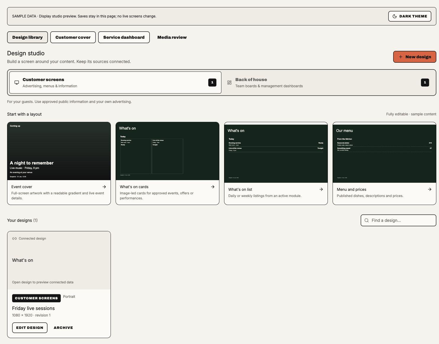
Designs groups designs into Customer screens for public advertising, menus and information, and Back of house for staff boards and management dashboards. Search within the selected purpose, filter by Shape (landscape, portrait or square) and inspect each card's audience, shape and size; a design with several frames also shows how many. These two library groups do not merge the three audiences: public, staff and management keep their separate source and publication permissions. Archiving removes a design from the working library; published programmes retain their frozen copy. Archive refuses a design that a screen plays: a dialog names those screens to take it off first. The dialog uses the screens on the current Overview page; the server checks every screen's default loop and slots' own designs again, including those of slots on several screens.
Each card names the screens that play the design: through its default loop or an active slot on one screen or several (paused ones do not count), or says Not on a screen yet. The list covers the screens on the current Overview page; with more than one page, or a library too large to load at once, a note says so.
Edited since N screens last published. A screen shows each design as it was saved when the screen last
published, so saving a design changes no screen. A card whose design was saved after some of its screens last
published says how many, with Publish to N screens (above). Duplicate (displays.design.manage) saves a copy
named "… copy" with the same content and Group branding lock, and shows it in the library. Add to a screen
(displays.design.manage, once the business has a screen) lists the screens of the design's audience, says whether the
design fits each one's shape or plays refitted and whether it is already in that loop, and adds it to the end of the
chosen screen's default loop. That saves like any loop edit; the message says to publish the screen and offers to open
it.
Choose New design to pick a visual starting layout, then its name, its audience on Back of house, and its Shape: Portrait, Landscape or Both (laid out in both sizes); Create and open editor opens it. Customer starters include Event cover, What's on cards, menus and listings; Back of house offers operations, shift, kitchen and management boards. Starting-layout previews are labelled sample content. New designs have no connected source until an authorised operator chooses one; selecting a layout does not approve or publish its example information. The selected Site's saved templates for that audience come first, under Your templates (below). A design started from one opens in the sizes the template was saved in, with the template's own sources connected, so there is no Shape to choose.
Customer screens can start from 33 looks in four groups. Straight looks are plain, in black, white, textured paper or one deep colour, with hairlines and at most one block of colour: Plain, Paper, Ink, Edition, Photo, Card, Swiss, Masthead, Frame, Half, Caption, Hour, Stripe, Centre, Sidebar, Underline, Footer and Two-tone. Bold looks add flat colour: Billboard, Slash, Blocks, Flood and Colour bars. Abstract looks set the words beside flat geometry: Glow, Steps, Facets, Horizon, Overlap and Lines. Wild looks tilt and clash: Tilt, Stickers, Diamond and Pop. They come first, under Looks, in the new-design picker and in the editor's Layouts tab; staff and management boards keep their own layouts. Each look is a handful of ordinary blocks made to be changed: the selected Site's name as one editable text block ("Your venue" when no Site is selected), one live block and a QR call to action: a QR code on a light plate, sized to scan from across a room and grouped with its prompt, Scan to find out more until you change it. Select the code or its prompt to choose Scan to book, Scan for tickets, Scan for the menu, Scan for what's on or Scan to order under Call to action, or to type your own words. The prompt refits to its box whether you type under Prompt words or in Text, and a chosen prompt keeps the look's capitals. The code links to This screen's QR code under Links to, so each screen shows its own code (below) and the stage draws a sample; choose A web address or A source's link there instead. The live block starts unconnected, so the stage reads "Choose a data source" until you choose a source and a photo.
Layouts are listed by use. Basics are the plainest starts: Blank canvas, Full-screen image, and a full-screen image with a headline and a line of text at the bottom left, bottom centre, bottom right, centre, top left or top right. The words sit over a shade on their side of the image; select the image and set its gradient to No gradient to remove it. The others are built for one kind of content each: Events (covers, cards, Plain list and other lists, posters, Entertainment spotlight), Sport, Food and drink (Menu and prices, Order here, Price board, Dishes and allergens, Supplier story), Bookings and offers (Book a table, Private hire and enquiries, Offer spotlight, Announcement, Promotion, Loyalty rewards), Information (Reception and welcome, Customer notice, Site information, Media and information, We're hiring, Report a fault) and Team boards. Each has a title in capitals as one text block, the Site's name and time on labels, and a live block already set to the presentation that suits its source. They start black and white with one spot of colour. Book a table, Order here, Loyalty rewards, Private hire and enquiries, We're hiring and Report a fault put a larger QR code on its own column; What's on cards, Menu and prices, Entertainment spotlight and Sport today carry the standard one. Layouts that staff boards can use never carry a code, so they publish without a screen code. A long name or title shrinks to stay on one line before it wraps.
A text or clock block has a Weight under Style: Regular, Medium, Bold or Heavy, for the bundled fonts. The Plain look, Plain list, Announcement and team boards start in a heavy sans. A Samsung TV on an older player package draws every weight as regular until its package is updated; the browser player needs nothing. A clock block's Shows, also under Style, chooses what it prints from the screen's own date and time in its Site's timezone: Day and time (the default, such as Fri 21:30), Month, Month and year, Date or Weekday, with Capitals to set it in capitals. A Month heading changes itself at midnight on the first of the month, so a monthly poster needs no edit. A Samsung TV on an older player package draws the day and time whatever is chosen, until its package is updated; a screen whose clock cannot be trusted reads Check device time. Colours, above both lists in the editor, applies one screen palette to looks and layouts alike: Paper, Newsprint, Navy, Plum, Clay, Forest, Flare, Volt, Riot, Lager, Pitch, After dark or Red top, Soupy Studio's Copper, Midnight, Moss, Wine or Mono, or each template's own. Thumbnails show the current size and colours. The tab shows one group of looks and one group of layouts at a time; choose another under Look group or Layout group.
Choosing a look or layout restyles the current frame in the current size straight away, with no confirmation, and keeps what you made of it: your headline, title and caption, connected sources, chosen photos, where the QR code leads, your own prompt, effects on those blocks and any blocks you added. Flip through steps to the previous or next template the same way, so you can try them one after another on your own content. A photo, source or code is left out when the new template has no place for it, and a layout sets the presentation that suits it. Undo brings the last one back. Templates use only blocks every installed player already draws, so they need no player update.
Your templates. Save as template in the Layouts tab saves the frame on the canvas, in all its sizes, as a named template for the Site chosen in the preview bar. Use it for your own artwork: put a poster frame on the canvas as a full-screen image, place a live block set to Date tiles over its empty area, add a clock block set to Month as the heading, and save. The template is a copy: its pictures, live blocks, their presentations and their connected sources come with it, and editing the design afterwards does not change it. To update a template, save the frame again and remove the old one. A template holds one frame; a Site keeps up to 50 for each audience.
Saved templates show under Your templates, above Looks, with a thumbnail drawn at the current size from sample records, and in New design for that Site. Customer, staff and management templates are kept apart, as designs are. Choosing one restyles the current frame exactly as a look or layout does and keeps your work. The largest text in a template is its headline and the next its line, and they take your own headline and line. A template with no headline leaves your own headline on top of it for you to place. Pictures already chosen when the template was saved are its artwork and stay; an empty image block takes your photo. A live block keeps the template's presentation and takes your connected source, or keeps the template's source when you had none. A template saved in one shape is refitted to the size you are working in. The pencil and bin under a thumbnail rename and remove a template; removing one leaves designs already made from it as they are.
Saving, renaming and removing need displays.design.manage for the whole business, as designs do; staff and
management templates also need that audience's publish permission. If an uploaded image a template uses is
later retired, the template stays, its thumbnail reads Image withdrawn and that block starts empty. A Media
library image in a template follows the same Media library rules as in any design made from it.
Saving is refused, with the reason, when the frame is empty, uses media that is no longer available, is too
large, or the Site already has 50 templates. Soupy Studio does not read these templates yet; its Brand kit
templates are separate. Saved templates are in the hosted web editor only.
With nothing selected, Texture in the screen settings adds Studio's Grain, Paper or Halftone over the page, photos and shapes, never over words, live data, clocks, video or QR codes. Size (50–250%) changes the grain, paper tooth or dot spacing and Strength (10–100%) how strongly it prints. A drag previews on the canvas and becomes one change, which Undo reverses. Players that predate textures show the screen without one, and later players skip any texture they cannot draw rather than refusing the screen.
Each screen can have its own permanent code from QR Codes, so one
design shows a different code on every screen. QR code on a screen's Player & QR tab opens it; the tab and the screen's
preview read QR code on screen, QR code ready · not on screen yet, QR code removed · still on screen or
No QR code.
Create QR code asks for a code label and a public HTTPS website. It needs displays.devices.manage for the
screen's Site and qr.manage with the QR product enabled; without both the dialog says so. QR Codes lists the code
as from Displays: change where it leads, pause it or read its activity there (Manage in QR Codes).
Creating or removing the code counts as an unpublished change for a screen whose designs link a QR code to it; the
screen shows it after its next publish. A screen whose designs never show its code has no QR change to publish. Publishing writes the screen's code into every QR code whose Links to is This screen's QR code. It
refuses, naming the screen, while the screen has no code, its code is paused, archived or revoked, or QR Codes is no longer
available. Publish across the Group writes each destination screen's own code. Its review waits for a
destination without a working code when either the Group programme or what the destination keeps (its own default
programme and slots, including slots on several screens) links to that code; the source screen's own code is not needed. A rollback shows
the screen's current code. Remove from screen clears the assignment only: the
code stays in QR Codes. While a design on the screen links to this screen's code, the screen can't go live without
one, so it keeps showing the old code. The code reaches players as an
ordinary address, so installed players need no update.
The compact Browse full library bar keeps the preview-source Site and optional Space beside its disclosure. Preview sources from starts on All authorised Sites. Selected Series then preview from their own currently authorised home Sites and Spaces, so a Series at another Site is visible without choosing the first Site in the workspace. With one available Site, previews resolve there directly. Choose a Site for other sources that depend on a destination, and then optionally choose a Space. Returning to All clears Space and previous preview results. All is an authoring preview only; a published screen still resolves its sources at its assigned Site/Space. The Series picker shows up to 150 authorised choices from a bounded business list; choose a Site to narrow the list. An All preview supports up to 20 distinct selected Series and retains at most 150 event rows per block. Existing event date, record-limit, price and media permissions still apply. Opening it reveals record type, audience and state filters, paging and a compact record list. The desktop example and phone example show a fictional matchday design. The Site selector stays on All while the canvas shows fixtures from the selected Series.
While a design is open, browsing media still adds that page to the editor's choices; opening another record is disabled until editing finishes. These controls retain the current source and audience permissions.
The editor groups its name, audience, draft status and Preview / Undo / Redo / Save draft / Close actions in one header. On wide screens, Blocks / Data / Layouts and Layers sit beside the canvas, with the selected block's settings on the right: a header naming the block and its frame and size, then Content, Style, Animation and Advanced, the same block settings Soupy Studio uses. Content contains the source, text or media; Style contains typography, colours, alignment, fills, opacity and supported gradients; Advanced holds position and size, Locked, Copy, Group/Ungroup and Remove. The close button returns to the screen settings. Compact block tiles keep descriptions in tooltips. Data layers show their source title and presentation so several widgets remain distinguishable. The canvas fits the available width with a 620-pixel height cap, keeping a portrait composition visible beside its controls. At intermediate widths, the inspector moves below; narrow screens put the canvas first and stack the tools and settings below it. Screen background clears the selection to expose canvas settings. Each Layers row has a Delete button beside its ordering controls. It removes only that layer from the current frame and size; Undo restores it. Locked layers must be unlocked first. This changes the draft, not a published programme. Edit content and Arrange canvas edit the same versioned document. Add text, uploaded image/video, cover images, shapes, QR destinations, clocks and permitted module widgets. Canvas controls retain dimensions, sizes, background, snapping, placement, layers, typography/alignment, fill and media fit. Applying a different layout asks before replacing the current frame's blocks and connections in the chosen size; other sizes and frames remain intact and Undo can restore the change.
Videos now come from the shared Media library. Add media accepts images, PDFs and brand fonts up to 20 MB each; an MP4 or WebM is refused and pointed at the Media library, on web and desktop alike. A video uploaded to Displays earlier keeps playing and can still be chosen for a video block.
Sizes and frames. The editor works like Soupy Studio's: size tabs above the stage name each size the design is laid out in (Landscape, Portrait…) with its frame count, and the strip under the stage shows the chosen size's frames in play order, each with its number, seconds and transition. + Add size offers the common screen sizes and Custom size… (inline width and height, 100–8192 pixels; up to eight sizes). Every frame laid out in every size gets the new one, refitted from its layout nearest in shape; a frame kept to fewer sizes stays as it is. The bin beside the tabs removes the chosen size from every frame, asking first when a frame is laid out only in that size, since that frame goes too; a design keeps one size. Select a frame to edit it; the selected frame offers Move earlier, Move later, Duplicate frame and Remove frame (a design keeps one frame). + Frame adds a blank frame after the selected one on its background and timing, in every size or, with more than one size, this size only. A design holds up to 12 frames, and live data sources belong to the whole design. With nothing selected, the settings start with the frame: Frame name, Seconds on screen (1–3600), Transition (Fade in or Cut) and, with more than one size, Shows in switches for the sizes it is laid out in (never fewer than one). Every frame and size change supports Undo.
Publishing turns each frame into its own slide, so installed players play frames without an update. A screen plays the frames laid out in the design size closest to its shape, in order, each for its own seconds with its own transition, and skips the others. A one-frame design plays for the loop's time instead: its own seconds and transition are what a new loop entry starts with. A programme's fallback design shows its first frame. Group branding locks cover every frame, so a locked design received from the Group can't gain or lose frames or sizes. The publish check covers every frame's media, QR codes and sources.
Animation. Under the canvas, the Block timeline draws a bar for each block in the selected frame, from when it shows until it goes, over a ruler of the frame's seconds; shading at a bar's ends marks its effects, and a bar with none reads No effect · press to choose. Choosing a bar selects its block and opens its Animation tab, and the inspector stays on the tab last chosen as other blocks are selected. Drag a bar to move it in time or an end to trim it; with a bar or end focused, arrow keys move it by a tenth of a second, Shift by a second. Play plays the frame on the canvas from the play-head, the play-head can be dragged to any moment, and Stop shows every block in full again. The selected block's Animation tab sets its In effect and Out effect (Fade, Slide up, down, left or right, Zoom or Pop, or none), Shows from and Until in seconds, and Play from this block. An effect takes 0.6 seconds, less for a block shown more briefly. A block shown until its frame ends keeps up when the frame gets longer. Each change supports Undo.
Players play effects from the start of each slide. Thumbnails, reviews and players that predate animation show every block in full for the whole frame. The browser player picks animation up with its next shell update; a Samsung TV needs the newly signed package installed on it.
On a screen, Fade in fades the new slide in over the previous one, which stays fully shown beneath it until the fade ends. About a second after each change, the player draws the next slide out of sight beneath the one on show: its images decode, its QR codes and fonts are ready, and its effects hold their first pose. At its turn that same drawing comes forward and only its effects and videos start, so it shows complete in its first frame. Videos still load at their slide's turn. A slide whose image fails while it is drawn ahead is skipped before its turn. A data block that pages through records decodes the next page's images while the current page shows. Players keep loaded fonts and downloaded images between slides. Older players fade both slides at once and redraw each slide's QR codes, images and fonts as it starts. The browser player picks this up with its next shell update; a Samsung TV needs a package signed after the change.
Position & size shows the selected block's coordinates
and dimensions in its disclosure summary, with position, rotation, size and layer controls inside.
Image and video blocks without an asset show a labelled dashed placeholder while editing, so they can be
selected and arranged. That placeholder does not appear in Preview or on published screens.
In customer-screen designs, an image block's Media library image opens the shared Media picker: choose an
image the business owns or has been shared, and its crop. It replaces the block's upload from Displays Media;
choosing an upload replaces it. The picker appears to people with displays.design.manage who may also browse
the Media library (media.view or media.manage), and only while the web Media library flag
(NEXT_PUBLIC_MEDIA_LIBRARY_ENABLED) is on. The canvas, Preview and publication review draw the chosen crop
under the viewer's own Media access; without it, the block shows a Media library image placeholder. Staff and
management designs refuse Media library images and videos when saved or published. Design library thumbnails do
not draw Media library images yet.
A video block's Media library video works the same way for videos: choose a library video, uncropped, or upload one there where the business has video uploads. The canvas and publication review show the video's poster frame; Preview downloads each chosen video's original to that browser under the viewer's own Media access and plays it, discarding the copies when Preview closes. Screens download the original itself, checked against the size and checksum frozen at publishing, so installed players need no update. An image block refuses a video and a video block an image, naming it.
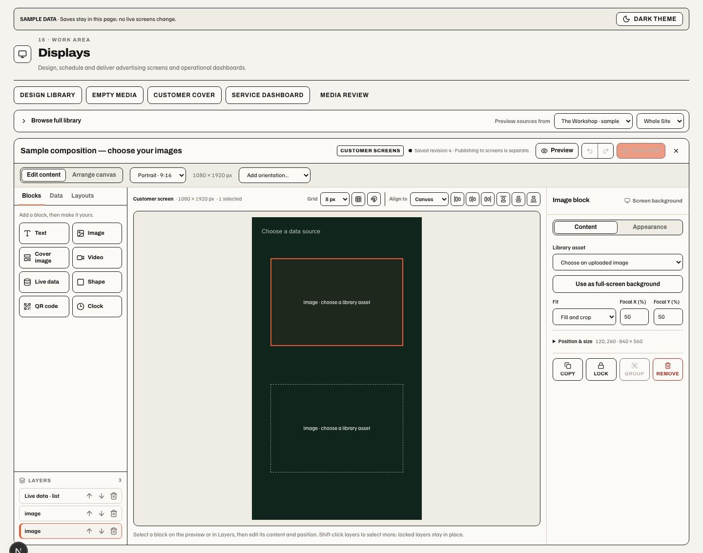
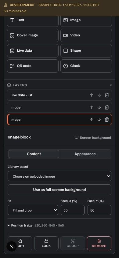
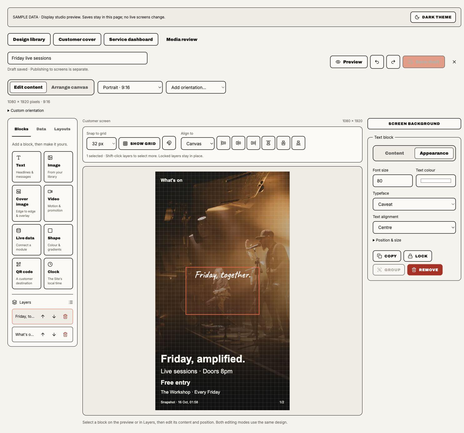
The canvas toolbar exposes Snap to grid (Off, 8, 16 or 32 screen pixels), an optional Show grid guide and Snap selected elements to grid. Snapping also applies while dragging or resizing in Arrange canvas. Grid guides are editor-only and never appear in Preview or playback. Shift-click layers to select several. The six alignment buttons position selected blocks at the left, horizontal centre, right, top, vertical centre or bottom. Align to Canvas uses the screen edges; Align to Selection uses the combined bounds of two or more selected layers. Alignment and explicit snapping preserve grouped layers as a unit; a group containing a locked layer stays fixed. Moves affect the current frame and size and support Undo.
Style → Font includes locally bundled Google Fonts alongside system and uploaded brand fonts. Inter, Archivo, DM Sans, Oswald, Playfair Display and Caveat are joined by Anton, Fraunces, Instrument Serif and Bricolage Grotesque. These four additions are not yet accepted on a physical player. The browser and Samsung player packages include the same font files and licences, so playback does not need a Google Fonts connection. Players need the updated shell to render the new font suite, cover/cards layouts and gradients correctly. Text alignment positions text within its block; the canvas alignment buttons position the block itself.
The Data library lists only compatible sources for the selected Site and audience. Choosing a source refreshes the preview with approved records and their currently authorised artwork. Refresh source preview also refreshes manually. Changing the Site, Space, audience, design or source connections clears the previous preview. Loading, unavailable and failed reads remain visible; a failed read does not create sample records. Source reads and artwork remain subject to module enablement, approval, scope and provider availability. A preview neither grants access nor changes the source.
Event paging. Event and Event series blocks offer All upcoming events or Choose a total (1–150). Upcoming includes published future dates more than 35 days ahead. Series selection and current Site, Space, publication and access rules still apply. Source reads retain a 150-candidate safety bound; if it is reached, the editor and screen explicitly report partial coverage and ask you to refine the Series or Site. “All” includes every admitted Event in that snapshot, never claims incomplete source coverage is complete. Other sources retain Maximum records (1–50).
Events per page is separate from the total selection. Show event images hides artwork without removing imageless Events, including poster cards. Timing belongs to the playlist: each block shares its slide duration across its pages. Editor previews cycle every ten seconds. When events do not fit (When records do not fit for other sources) chooses what the extra pages do. Turn pages within this slide, the default, is the sharing above. Continue on more slides plays the same design again for each further page, as slides of its own: every page gets the frame's full seconds, its transition and its blocks' effects, so the design runs longer when there are more records and shorter when there are fewer, following the records the screen holds at the time. A design runs to at most 30 such slides, and a slide that waits for its video plays once. The line-up's seconds and totals count the design once, and its panel says each page plays for the full time. A Samsung TV on an older player package turns the pages within one slide instead, until its package is updated; the browser player needs nothing. Covers and spotlights show one Event per page; lists and cards use the requested maximum, adding pages if the block needs fewer rows to keep text readable. When a live block has more than one page, Previous page and Next page with Page N of N sit under the canvas, for the selected block or else the first paged one; pages turn by themselves until the block is selected or flicked. They never change the saved design or its Event clock. Cards size to their content instead of stretching short listings to fill the canvas. These controls require the updated web/player renderer; physical-player acceptance remains separate.
Data groups sources under their module's name, with business-wide sources under Business. Sources that Soupy Studio also offers use Studio's names: Performances, Menus, Loyalty rewards, Sport screenings, Ordering menu, Supplier stories and Site information. Presentation lists the styles that suit the chosen source first, under Suits this source; every other style stays available under Other presentations. A new block starts with the first suited style, so a menu starts as Menu and prices. Blocks already on screens keep their presentation.
Date tiles lists dated records as a monthly poster does: each record's day on a calendar tile, its weekday (FRI) over its day (4), in the screen's timezone, beside its title. With Rows set to Fit to block, the records on show space out to fill the block and the type grows to suit: four events fill the block in large type, eighteen in small. They use fewer columns than Columns, up to (one to four, two unless changed) when that sets them larger. The type shrinks only as far as the block's Font size; records that still do not fit are shared evenly between pages, so two pages of nine, not twelve and six. A fixed number of Rows (one to four) keeps the grid exactly as set. Tile colour colours the tile, and its lettering turns black or white to read on it. A long title takes two lines and then ends in an ellipsis; a record with no date shows its title alone. The block draws to its own edges with no panel, so it sits inside artwork placed behind it, and shows a title only when Title override is set. Date tiles suit sources with dated records and are listed with the calendar under Suits this source. A Samsung TV on an older player package draws the block as a plain Schedule / list until its package is updated; the browser player needs nothing.
Choose Full-screen cover to show one source record with its artwork and details, or Image cards to show several approved records. These sit alongside lists, calendars, menus, metrics and other presentations. Missing artwork leaves the source text and background available. Cover image adds an uploaded image across the canvas; image fit and focal position control its crop. Canvas backgrounds, images, video, shapes and source covers can use a gradient with two to five colour stops, each with position and opacity, plus a direction or custom angle. Transparent stops reveal the underlying content. The editor and player use the same gradient values.
With Image cards selected, Card look offers Classic cards or
Event posters. A poster draws each record in portrait like the website's event embed: the source artwork
under a scrim, the title slanted in capitals, the date and year, a date tile, the start time and, where
Show ticket prices allows, the price or "Sold out". QR code to each event (on for new posters) prints
that record's own public page as a code; a record without a credential-free HTTPS page shows no code, so private
links never print. On a player the link carries visit-analytics tags: utm_source names the display asset
(display-<slide name>), utm_medium is qr, utm_campaign the programme and utm_content the screen
(screen-<id>); editor previews show the untagged link. Accent colours the rule at the top of each poster. Card layout fixes the grid
(one at a time, stacked, side by side, 2 × 2, a row of three or four, 3 × 2, 2 × 3, 4 × 2 or 2 × 4) or leaves Fit to block sizing it from the
block and its font size, for either look. Events per page sets a maximum within that layout; compact classic
cards may show fewer to keep text readable. Records beyond one page go onto more pages with a 1/2 counter.
On a player, any paged live block (cards, lists, menus, tables and covers) shares its slide's duration evenly
between its pages, so a 24-second slide with two pages shows each for 12 seconds; timing is set only on the
playlist. A slide that plays its video to the end, editor previews and players that predate slide-timed paging
turn pages every 10 seconds. On a playing screen and in the draft preview, a page change is a visible turn: the
records on show (classic cards, rows, date tiles or calendar days) lift away one after another in reading order, then the next page's
rise in, and poster page dots slide to the new page; a cover's photo fades in place. With Continue on more slides,
each page's records rise in as its slide starts. Event posters in player 1.0.4 and later travel sideways as a wall. On Samsung player 1.0.6, Soupy prepares the moving posters ahead of time and keeps both pages in place until the TV finishes the turn.
The heading stays in place while the last page moves into the first in the same direction. This also applies when each
page has its own slide. A change to a different design still uses its selected transition. Pages shown for under about
1.5 seconds, the editor's canvas, Next page and thumbnails change page at once, and reduced-motion settings turn
the movement off. Samsung TVs need the 1.0.3 app for the turn; browser players pick it up with their
next shell update. Three customer starting layouts, in the new-design picker and the editor's Layouts
tab, begin with posters: Event poster wall (2 × 2 in portrait, three in a row in landscape), Event poster
spotlight (one poster filling the screen) and Event poster row (four in a row in landscape, two in portrait),
each with QR codes on and no source connected. A poster block's header follows the Studio mock-up: Label above
the title (filled with the Site name in the starting layouts, and also printed on each poster) over a heavy
Title override, with "Scan any card to book" when codes show, the screen's clock (only when its clock is
trusted) and page dots. With neither a label nor a title the block has no header. Posters update with the source like any
other block. Players that predate event posters show classic cards instead.
What's on shows the Site's published Events. Event series shows only the live Events of the Series ticked under Series: up to 20 active Series homed at the Site. With Upcoming, both list every published future Event (see All upcoming events above); with Today, This week or Current snapshot, an Event series reads Events starting up to 90 days ahead and What's on 35. Until one is chosen the block reads "Choose at least one Series" and the screen cannot be published. Event rows use the published facts Studio uses: start and end time, "Sold out" and the lowest public ticket price ("From £12", "Free entry"). They list the Event's published line-up, as its public page does; Studio packs also leave out acts without current promotional approval. Rows stay listed until the Event ends, past midnight for overnight Events. An end time the clocks repeat means its later occurrence; one they skip is left off. Times in the editor preview use the selected Site's timezone. Show ticket prices is on for new Event blocks; blocks that predate the setting keep prices hidden until it is switched on. A screen shows a price only while checkout would sell at it, so a ticket type that is sold out, paused or in a full capacity pool sets no price while another still sells, though a Studio pack still uses its price. The price disappears when sales close or reach their cut-off, when a ticket's sale window opens or closes, once the screen's source data is more than an hour old, and while the player's clock is untrusted; a connected screen shows the current price again at its next source update. Price and sale changes never blank a screen or make it download its programme again. "Sold out" always shows. Players that predate ticket prices keep the older wording and never show prices.
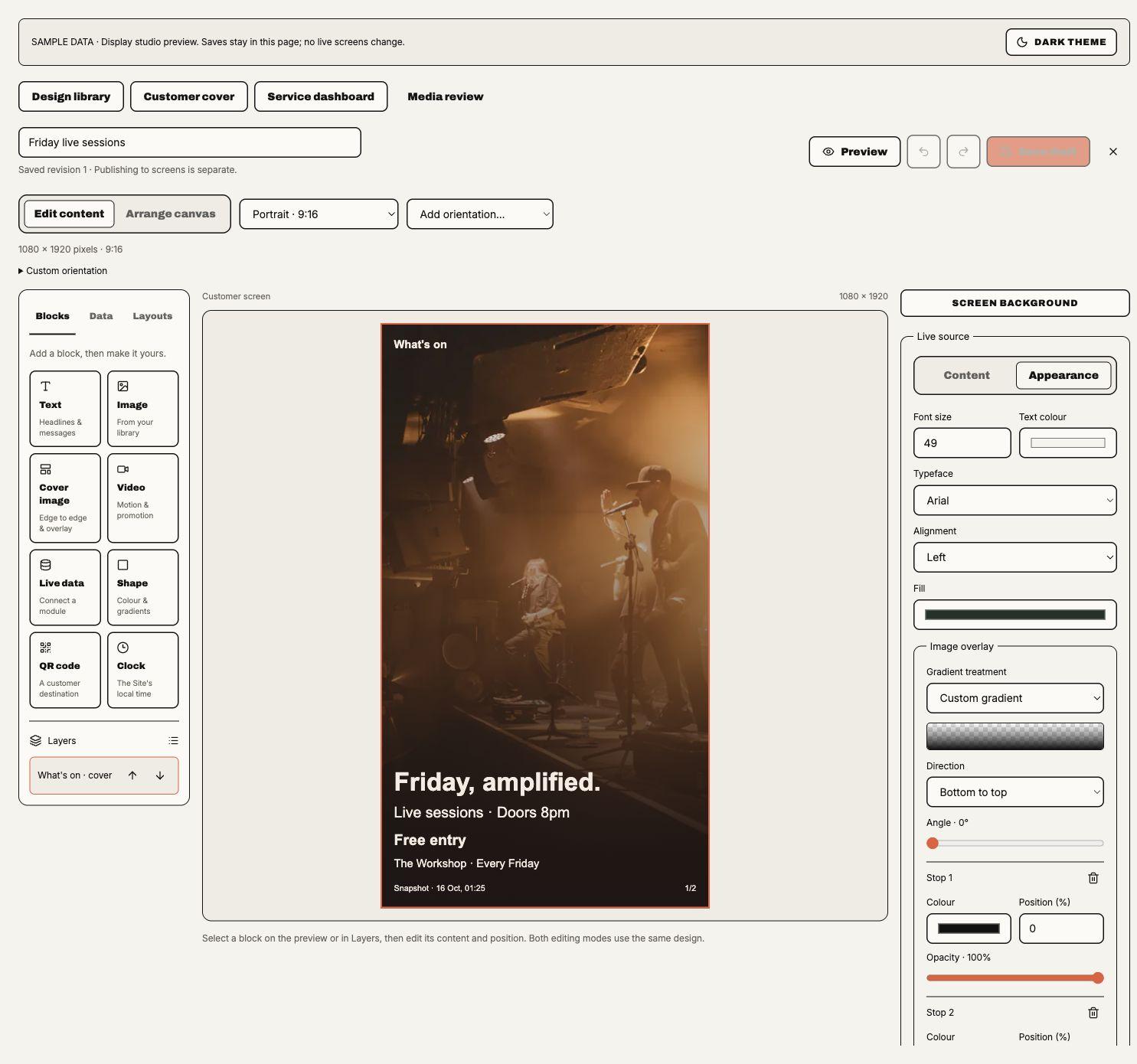
Preview opens the chosen size without publishing; a design with several frames plays them in turn, each for its own seconds, with Previous frame and Next frame to jump. The editor autosaves drafts and also provides Save draft; its status distinguishes unsaved, saving, saved and conflicting revisions, and says whether the saved revision reads Screens show saved changes once they publish: the editor has no publish button, because screens publish (above). A conflicting local draft remains available to download before reloading. Draft saves never change a published programme. Review uploads before using them; retiring media affects its eligibility. This studio is implemented for the web workspace, including desktop web; it does not add a native mobile editor or establish installed-player acceptance.
Shared playlists and programmes are an older way to group designs. Slots can still play them; a screen's own default loop is the usual way to choose what it plays. Saving one changes no screen: each screen that plays it counts the edit as an unpublished change until it publishes.
Edit playlist lays out the designs this audience may show on the left, the loop in the middle and the chosen slide's timing on the right. Drag a design onto the loop (or choose its +) to add it, drag tiles to reorder them, or use Earlier, Later and Remove. Tile width follows time on screen, and the loop's total length shows above it; Set every slide to applies one duration to every slide. A slide's On screen for, Transition and, for designs with a video, Video timing are set here; a new slide starts with the design's own seconds and transition. A design with several frames plays each for the time and transition set in its editor: its tile reads N frames · total s, the panel says so instead of offering seconds and a transition, and the loop's total counts its frames. When a slide has a live block, the panel says its pages share the slide's duration. Shows sets when a slide plays: Every loop; Only between dates (both days included, in the screen's timezone; either may be left open); or, for designs with a live block, Only while its events are on sale (one of its events is on sale in a source update from the last hour, the same check printed prices use). Tiles name a slide's rule. The player skips a ruled slide whenever its rule doesn't hold, including when the screen can't trust its clock; if no slide may play, it shows the programme's fallback design or holding message. Players that predate slide rules play ruled slides every loop. Thumbnails show each design's layout without reading its live sources. Changes to a shared playlist reach each screen whose slot plays it when that screen next publishes; Schedule marks it Changes not published. Preview publication, review the audience and sources, and publish an immutable revision. Rollback also has an explicit review and does not revive revoked source authority. Publishing admits each Media library image or video again: ready or retired, and owned by the screen's business or shared with it. Rollback refuses a publication whose Media library image or video was withdrawn, naming it. Publishing, rollback and Group distribution refuse Media library images while Media delivery is not set up. Screens already showing them keep their last programme and keep checking in until it is, unless something is revoked meanwhile, such as a withdrawn image or a source whose rows lose their Media artwork without delivery: then the screen clears and, while its programme still shows a Media library image, stays blank until Media delivery is set up.
Scheduling, sources and distribution
Schedules resolve temporary override (Takes over), dated assignment (Between dates), recurring assignment (Every week) and default in that order. At equal level, local assignments outrank Group ones; equal-precedence overlaps block publication. Site timezone, overnight windows, exclusions and slot end dates are part of the publication, not a browser-local assumption.
Source bindings check each enabled source module, capability and exact Site/Space. They renew approved live facts within the frozen layout. Public Sport needs an explicit display approval, not only a private screening selection. Talent-only performances need confirmation/promotional approval. A performance shows the act's first Media library photo, the one Studio uses, or its verified older upload when the profile has no Media photo. Withdrawing the Media photo removes it from screens at their next sync; the older upload does not replace it. Withdrawing the profile's promotional approval removes the performance. Bookings menus use published versions; public EPOS retail prices and eligible ordering offers have separate review. Generic private Messages channels are not copied onto a screen.
Management metrics retain source meaning: expected covers are not occupancy, planned shifts are not attendance,
stock is not sellability and till delivery is not order ready. Missing observations remain missing, not zero.
Guest names need explicit opt-in and bookings.guests.view; management publication does not grant blanket
private-data access.
Group distribution requires an actual shared Group and authority at every selected destination. Each destination reports its own result. A destination with saved slots (including slots on several screens, paused ones too), the shared playlists and programmes they play, designs in them or player settings that are not on its player yet is held back, as is one last published before the screen-publish release whose slot designs may differ from the published copies it shows: … has saved changes that aren't on it yet. Publish them from its page first. The Group publish would otherwise send them unreviewed. Its own default loop does not hold it back, since the Group publish keeps the version already on the screen. Media keeps its original owner so withdrawal reaches distributed/adopted copies. A Media library image or video in an image or video block publishes at a destination only under that business's own Media share of it; distribution never shares on the operator's behalf. The destination review asks for that share, or says why none would help: it was withdrawn, or it is retired, which Media does not share. Management comparisons keep business, Site, seller and currency labels separate; sibling membership alone is not cross-business permission. An Event series block needs its Series chosen again for each destination Site, because Series belong to their home Site.
Offline playback and permissions
A player stages complete signed bundles, verifies media hashes and activates atomically at a slide boundary. Failed downloads or insufficient storage keep the last valid bundle. It caches shell, layout, fonts, media, recurrence rules and source snapshots. Private cached content uses a persisted device key.
A publication holds at most 500 media files and 1 GB, a programme at most 150 source images, and a publication at most 100 Media library images and videos in image and video blocks together. A Media library video counts at its own size, so ten 95 MB videos nearly fill the 1 GB. Media library artwork from sources and Media library images in image blocks count at 8 MiB each, the bound of the 1920-pixel display JPEG, until the screen verifies their real size; artwork alone fills the budget at 128 images. A rendition larger than the bound is refused when it is verified, and the screen keeps its last bundle.
All three audiences retain their last authorised programme during an outage and restart. An offline device cannot learn revoked access, disabled modules, changed prices or cancellations, so ticket prices stop showing an hour after the last source update or at the next sale change, whichever is first. Successful authenticated reconnection persists revocation and purges revoked content before replacement downloads; later fetch failure cannot restore it. Network failure alone does not invent revocation.
Reconnection revokes a device when device, publisher, entitlement or bound-source access ends. It also revokes when an upload from Displays Media in the programme is retired or unavailable, or when an older Event, menu or performer image outside the Media library is refused after publication. A source that cannot be read, such as a kitchen plan not yet made for the new day, shows as unavailable on its block and the screen stays paired. A withdrawn Media library image used by an Event, menu dish or performer leaves screens at their next sync, and previews and new publications leave it out instead of refusing; the row stays, without an image. A Media library image or video in an image or video block leaves screens the same way when it is withdrawn or, at a Group destination, its share is revoked: each publication's images are rechecked at most once a minute, the block shows nothing and the screen stays paired. A retired image keeps showing. In both cases the player clears the screen and discards its saved programme and media, then shows the replacement once it has downloaded again. A screen brought back from retirement leaves out an image withdrawn or unshared while it was retired, even once it is shared again, until the screen publishes it again. If approved sources grow past 150 images after publication, screens show the first 150 in screen order and later rows without images; publishing still refuses more than 150.
Cached future coverage is bounded, up to 35 days where the source supplies it (90 days for Event series; Upcoming Event blocks by the 150-candidate bound instead). Exhausted coverage uses a fallback instead of claiming nothing is scheduled. Dated financial snapshots stay dated; unreliable clock state suppresses schedule-dependent claims. Playback telemetry proves software reports, not screen power or audience impressions. Browser restart acceptance needs a persistent kiosk profile; Samsung QMC packaging/install/panel controls need real device qualification. A Samsung package is signed for one orientation: use the portrait package on a portrait-mounted panel and set that screen to portrait with 0° rotation. The package runs on Tizen 6.0 and later, including 2021 consumer TVs such as the AU9000 (Chromium 76) as well as the QM43C (Tizen 7.0). Consumer TVs install it in Developer Mode and have no kiosk auto-start: open Soupy from the home screen, and again after a power cut. Development installs require the TV's DUID on the distributor certificate.
Samsung signage panels such as the QM43C install the app from Soupy's hosted installer: Home → App Management →
Install Custom App, then enter https://soupy.ai/display for a landscape panel or https://soupy.ai/display-vertical for a
portrait-mounted one. The orientation is fixed when the app installs, so pick the address that matches how the panel
hangs. The panel reads sssp_config.xml there and
downloads the signed soupy-displays.wgt it names. Each package installs only on panels whose DUID is on Soupy's Samsung
distributor certificate; a new panel needs its DUID added and both packages signed again before it can install. The
hosted package changes only when a newly signed version is published, not with each web release. Installing from the
hosted address has not yet been checked on a physical panel. Opened in a web browser, either address goes to the
browser player at https://soupy.ai/display/player, which pairs the same way and keeps working offline once loaded;
use a persistent kiosk profile so pairing survives a restart. Browser screens set up earlier at
https://soupy.ai/displays-player/index.html keep working there.
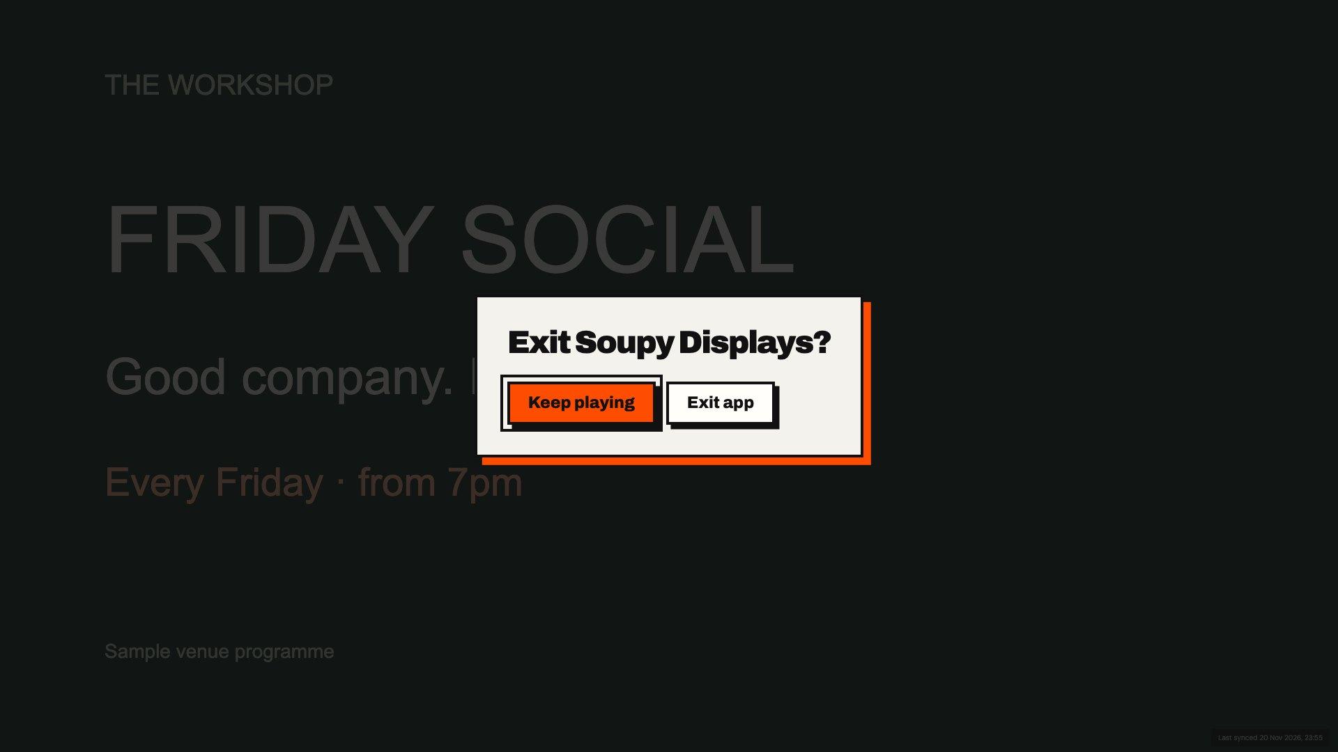
The player's own screens (pairing, starting, Waiting for a programme. and errors) carry Soupy Displays branding and the Displays character; programmes play full screen without them. In the Samsung 1.0.2 candidate, Pair this screen. shows eight code tiles, each an asterisk until its character is typed. Type the code with the TV keyboard: the eighth character connects. Letters are upper-cased, and spaces and dashes in a pasted code are ignored; I, O, 0 and 1, which Soupy never issues, are refused and the hint flashes (unless reduced motion is on). Choosing Done moves to Connect screen, which asks for the missing characters while the code is short. After access ends the screen shows Pair it again. and needs a new code. The arrow keys move between controls. Return opens Exit Soupy Displays?; choose Keep playing to stay or Exit app to close. Switching away stops visible playback; returning checks for updates and displays the screen's current programme. The public store listing is pending.

| Capability | Responsibility |
|---|---|
displays.view | Read permitted screen/programme workspace. |
displays.design.manage | Author designs, media, a Site's saved templates and design-library work, and change screens' default loops and slots, including slots on several screens (saved, not published). A staff or management slot on several screens also needs the business-wide publish right for that audience. |
displays.publish.public | Publish public screens: Publish changes, Roll back and the several-screen reviews; with displays.design.manage, History's By and Preview. |
displays.publish.staff | Publish staff screens, the same way. |
displays.publish.management | Publish management screens with source authority, the same way. |
displays.devices.manage | Add, change, pause and delete screens, create TV groups, pair/revoke players, handle device health work and, with qr.manage, give a screen its QR code. |
displays.settings.view, displays.settings.manage | Settings reach and authority. |
Enabling Displays and assigning a person Displays capabilities are separate. The implemented /displays/settings route mounts the Displays workspace and initially opens Distribution,
including the offline-operation explanation. Screen defaults, device controls and publication review remain
on their operational screens. Disabling the exact entitlement stops authoring/renewal and clears devices on
the next authenticated handshake; offline copies persist until that contact.